Translating the Marvel comics onto the big screen in the Marvel Cinematic Universe is a massive feat following decades of characters, abilities and costumes. Fans are grateful to have seen updates in everyone's wardrobe, from Luke Cage to Scarlet Witch, as well as for the nods to each character's classic look.
Even so, many of the costume choices in the MCU are also of the cringe-worthy variety, particularly when it comes to some of the early designs that were quickly remedied to appease fans. At least these changes follow comic canon, given how often each superhero has been written with a new look over the years, but there have to be people at Marvel who feel embarrassed about some of these costume fails.
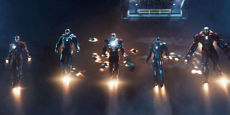
20 The Many Suits Of Iron Man
Some fans found the many different suits of Iron Man 3 to be a clunky mess. Some also wondered why so many suits were needed, especially if Tony could add new adaptations to perfect the suit he'd need for regular work. They seem wasteful unless Tony was building his own army, and some of them don't even look like Iron Man.
19 Veiny Hulk
A big issue with superheroes and villains is when movie makers tell without showing, like they did with Batman's Bane in The Dark Knight Rises. Hulk had a similar treatment with his too-veiny look. Audiences could see how strong the big guy was without the necessary 'roid rage look.
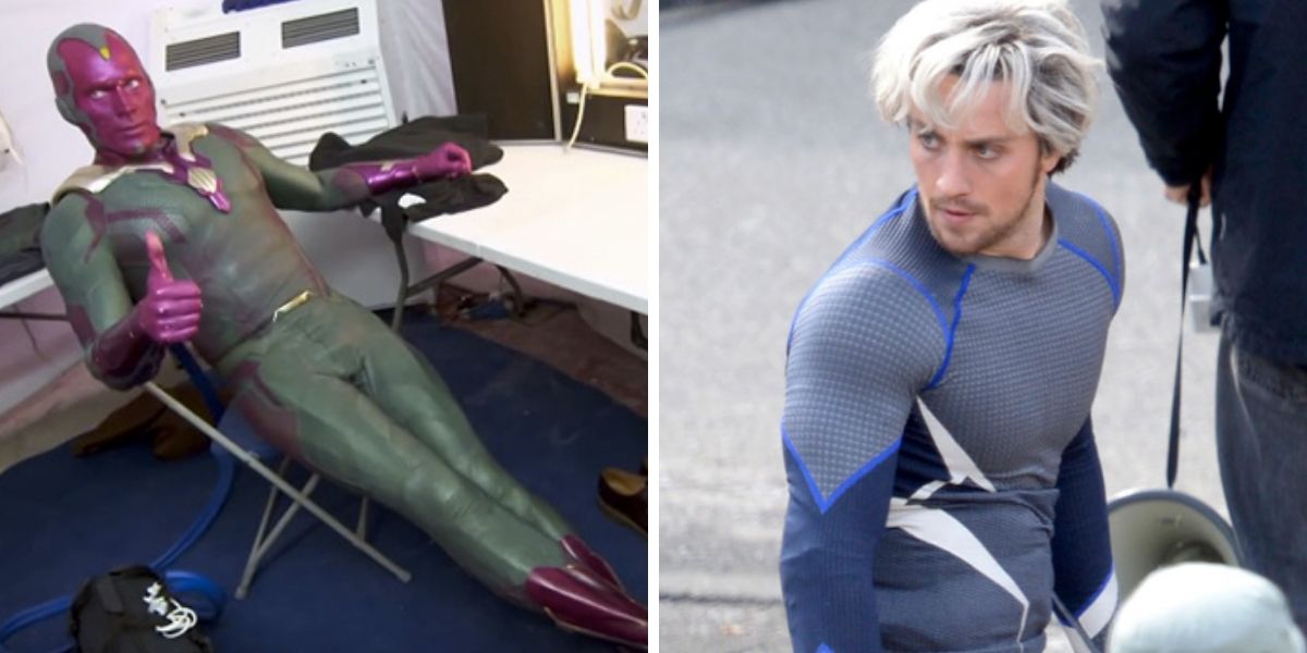
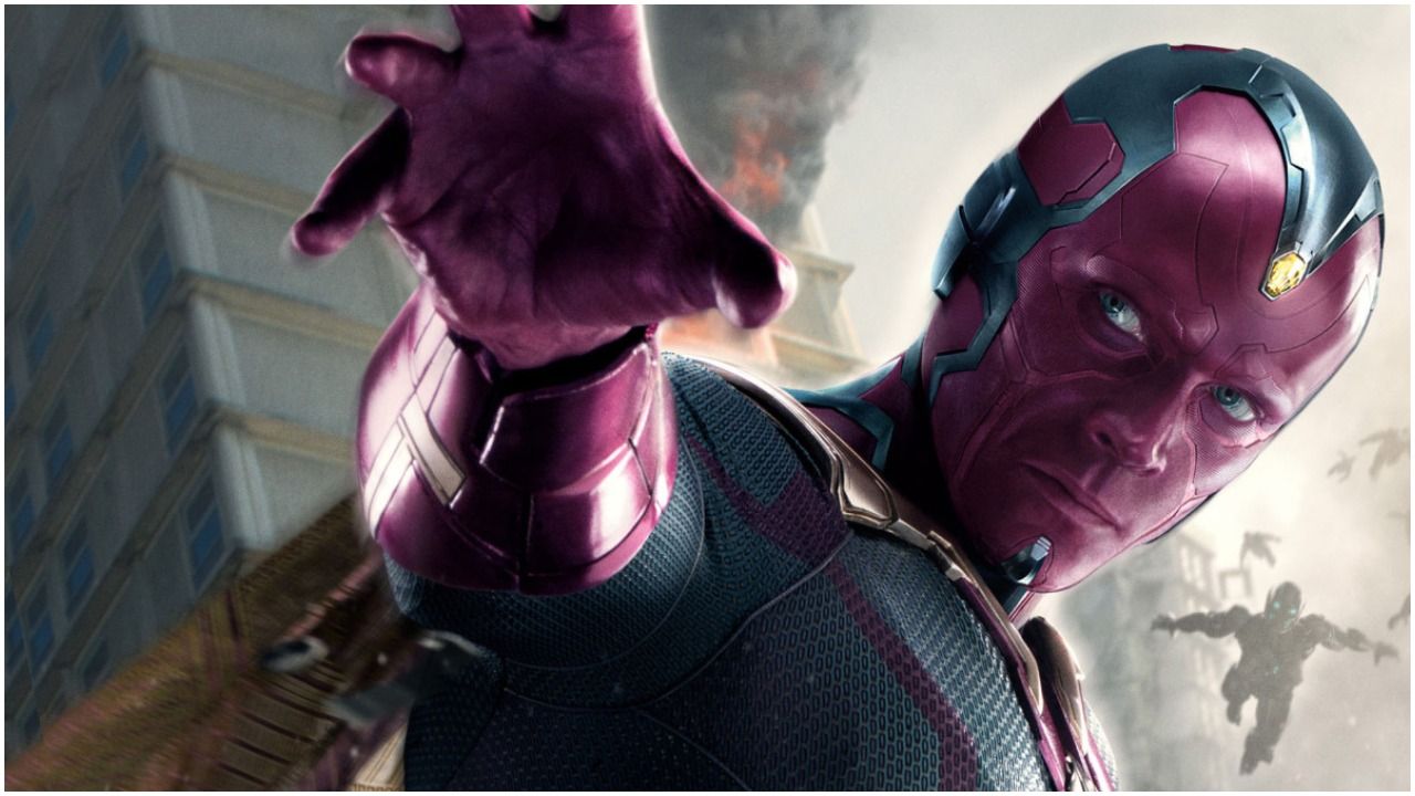
18 Vision's Cape
Lots of characters received fantastic updates when translated to the MCU, but the Vision certainly wasn't one of them. Outdated and silly-looking, he pretty much stepped out of the pages and onto the screen without much modernization, which made him really stick out from the rest of the team.
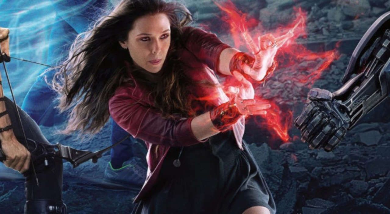
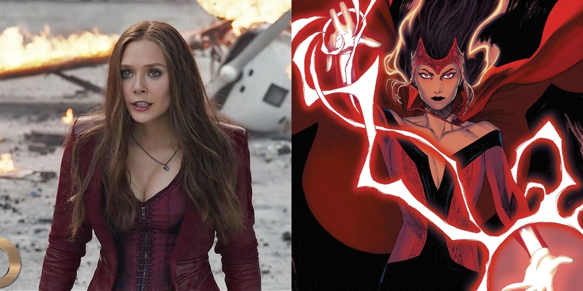
17 Scarlet Witch's Goth Getup
What was the idea behind Scarlet Witch's Gothic getup? It would seem as if designers wanted her to appear Wiccan to match her name, then they went overboard with it with what they felt a stereotypical witch might look like. This isn't a superhero costume. We get the need to nix the wimple but this wasn't the answer, either.
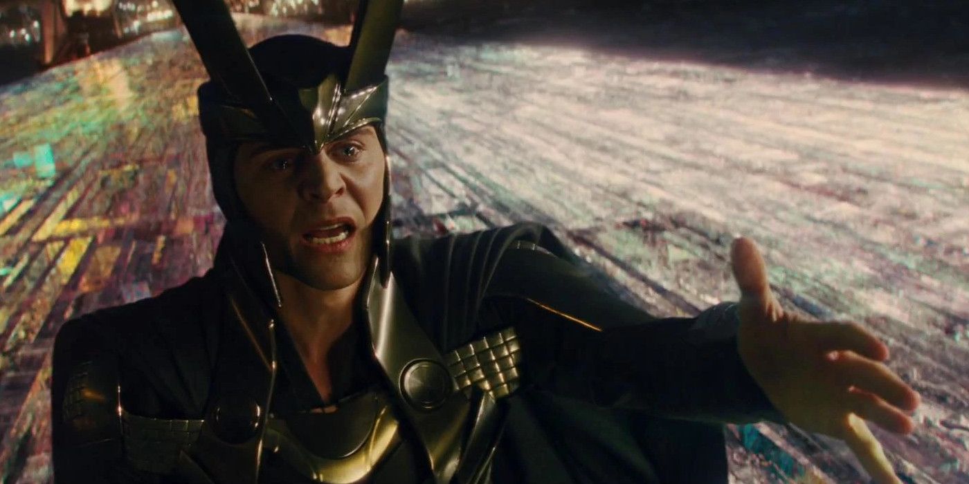
16 Loki's Horns
Yes, Loki has horns in the comic books, but does he really need them in the films? He's devilish enough without them, and they make him look like a silly little boy trying to rule the universe instead of the dangerous force to be reckoned with that he is. We were happy to see the horns gone.
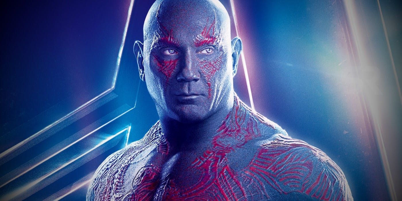
15 Drax's Non-Destroyer Look
Drax was engineered to be a murderous monster, and as much as we all fell in love with Dave Bautista in the role, he really doesn't give off the same kind of menacing air that he does in the comics, particularly when it comes to his look. He's not even green like Drax the Destroyer should be.
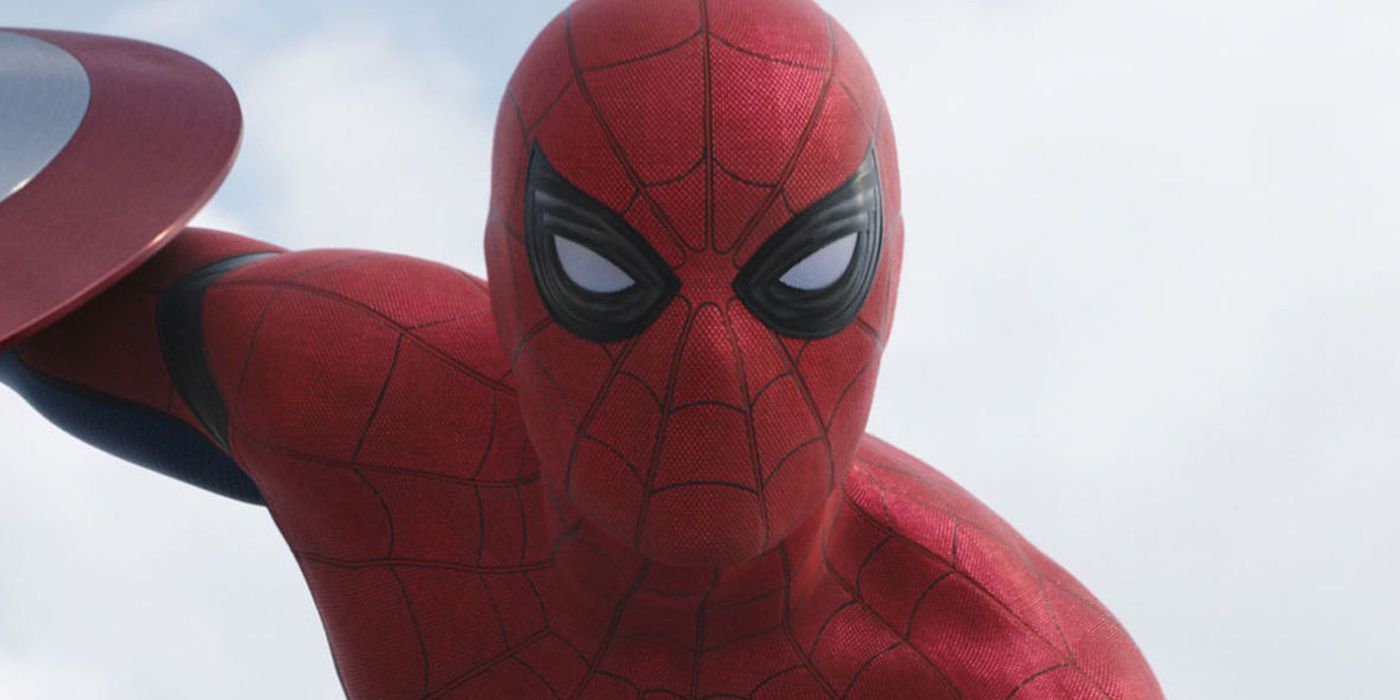
14 Spider-Man's Bright Blue Suit
Spidey's classic red and blue look just didn't work well on screen, giving him too much of a cartoonish appearance. It almost gets a pass since each hero's early costumes are bound to be rough. Subsequent changes made him appear sleeker and more like an Avenger, particularly when Tony got a hold of them.
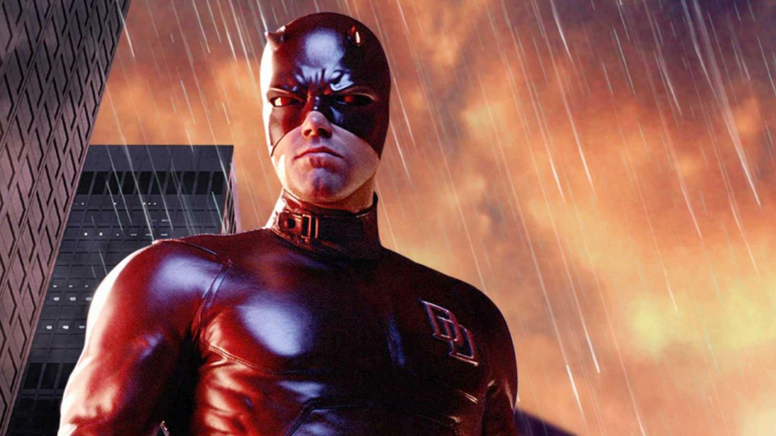
13 Daredevil's Complicated Getup
We're used to seeing rough costume prototypes on new characters, but Daredevil's fledgling hero look wasn't bad. Its updates, on the other hand, made it more difficult to watch him in action, which was too bad given how great the series was. The mask in particular made it difficult to watch Matt in battle.
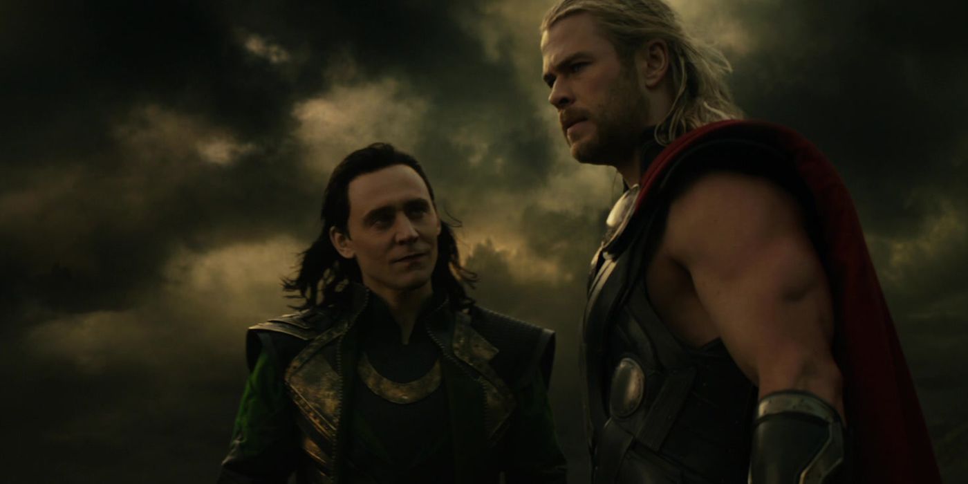
12 Thor's Dark World Look
Everyone has a favorite Thor look, from the latest adorable fat Thor to the cool transformation he underwent in Ragnarok. Dark World is often cited as fans' least-favorite of the MCU films and Thor's costume could certainly be a contributing factor. It's not very flattering and looks too round and cartoonish.
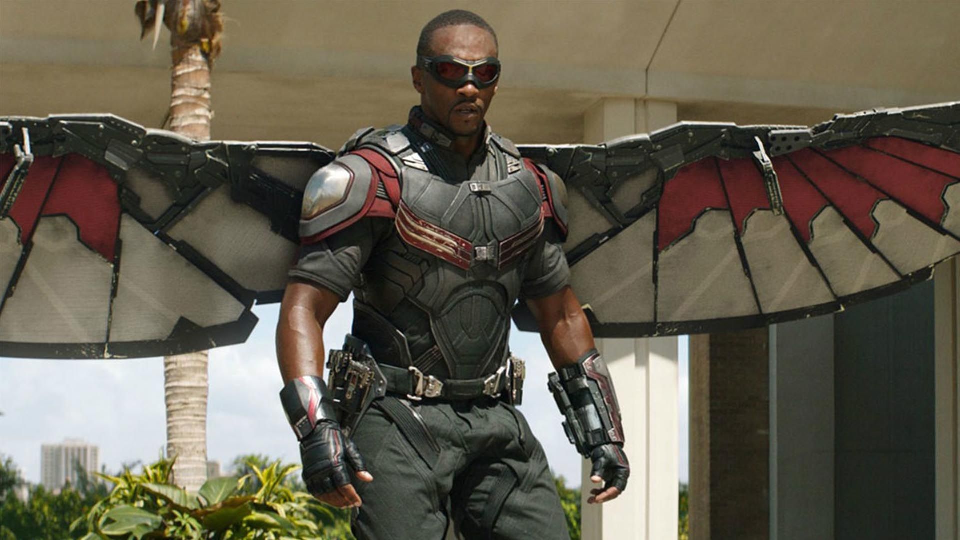
11 Falcon's Civil War Wings
Of all of the characters with techy looks, Falcon is definitely the coolest, but his look in Civil War wasn't the best. Previously he'd worn sleeker, more heroic designs, but this one looked clunky and goofy, with a bit too much Captain America branding and curved, feather-ish wing designs.
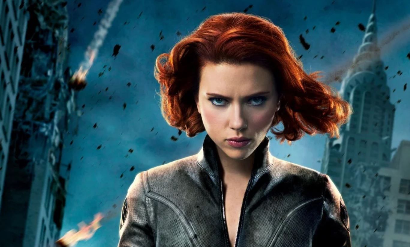
10 Black Widow's Age Of Ultron Look
While Nat's obviously had more hair changes than the men of the MCU, her outfits have changed less noticeably over the years. Her costume's biggest changes in Age of Ultron made no sense, adding color and neon lights that completely disregard her constant need for stealth. The electricity contained within could have been illustrated in a more subtle way.
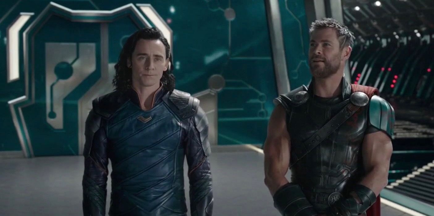
9 Loki's Blah Ragnarok Look
Since when does someone as theatrical as Loki tone it down to look like a blah background character? Perhaps this choice was made to let Thor shine more brightly in the film, which wasn't hard to do given its superb writing, but it really is a boring look for the trickster, no matter his role.
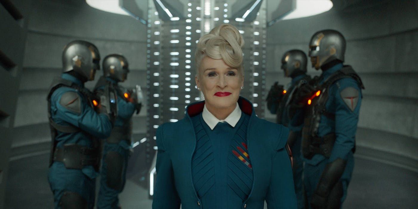
8 Nova Corps
Why was Yondu so scared of the Nova Corps when they looked like a bunch of 1980s cartoon character extras on a show like Rainbow Brite or Teenage Mutant Ninja Turtles? "Alien" doesn't have to mean "goofy as heck." These are supposed to be space military officers, MCU. Have some dignity.
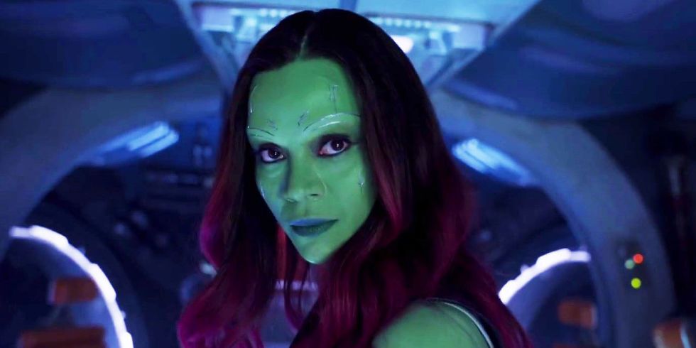
7 Gamora's Non-Dangerous Look
While we all miss Gamora and her sacrifice moved us to tears, she definitely didn't look or act the part of the most dangerous woman in the universe, which is how she's known in the comics. She was used mostly as a plot device for Thanos, which is infuriating for many fans, and her wardrobe completed her non-threatening look.
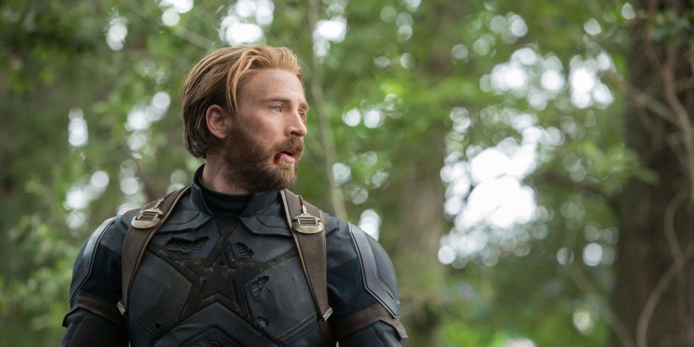
6 Cap's Depressing Infinity War Look
In a way, Captain America's Infinity War look worked well, since it mirrored the bleak tone of the movie's end. It just didn't fit Steve at all. Cap is meant to be a symbol of hope, not a depressing reminder of how the Avengers failed in their biggest mission and cost the universe half of its lives.
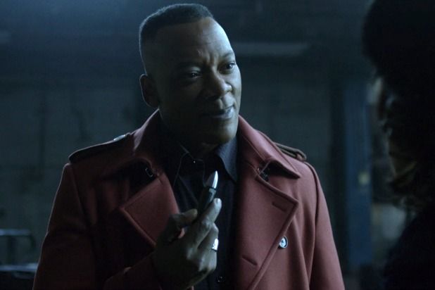
5 Diamondback's Looks
Diamondback never had a great look in the comics, so Netflix could have really gone with anything to update his look as they did with Luke Cage. Instead, they pretty much mirrored that lackluster comic look and added a really stupid helmet, making him look like a Nova Corps recruit.
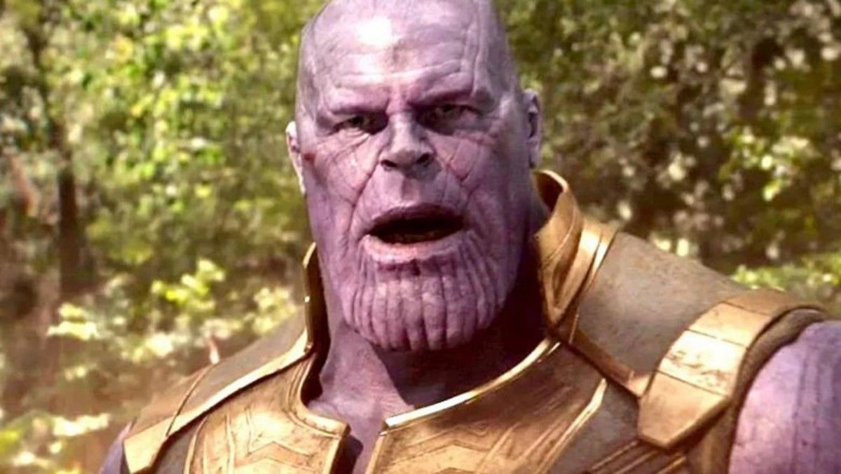
4 Thanos' Sleeveless Costume
Thanos' sleeveless ensemble in Infinity War, which went completely off-road from his previous in-character looks that followed the comics, was an utter fail. He looked completely non-threatening and silly. Even if he doesn't need more armor due to the gauntlet, that doesn't mean he has to dress for a day at the beach, either. Bad guys should look fearsome.
3 Scarlet Witch's Red Look
The MCU just can't seem to get Scarlet Witch right. This weird corset design does not leave room for fighting, even if her powers don't call for a lot of hand-to-hand combat. It's the most restrictive look for any character and makes zero sense outside of making her look more attractive, which shouldn't be the primary objective when it comes to dressing superheroes.
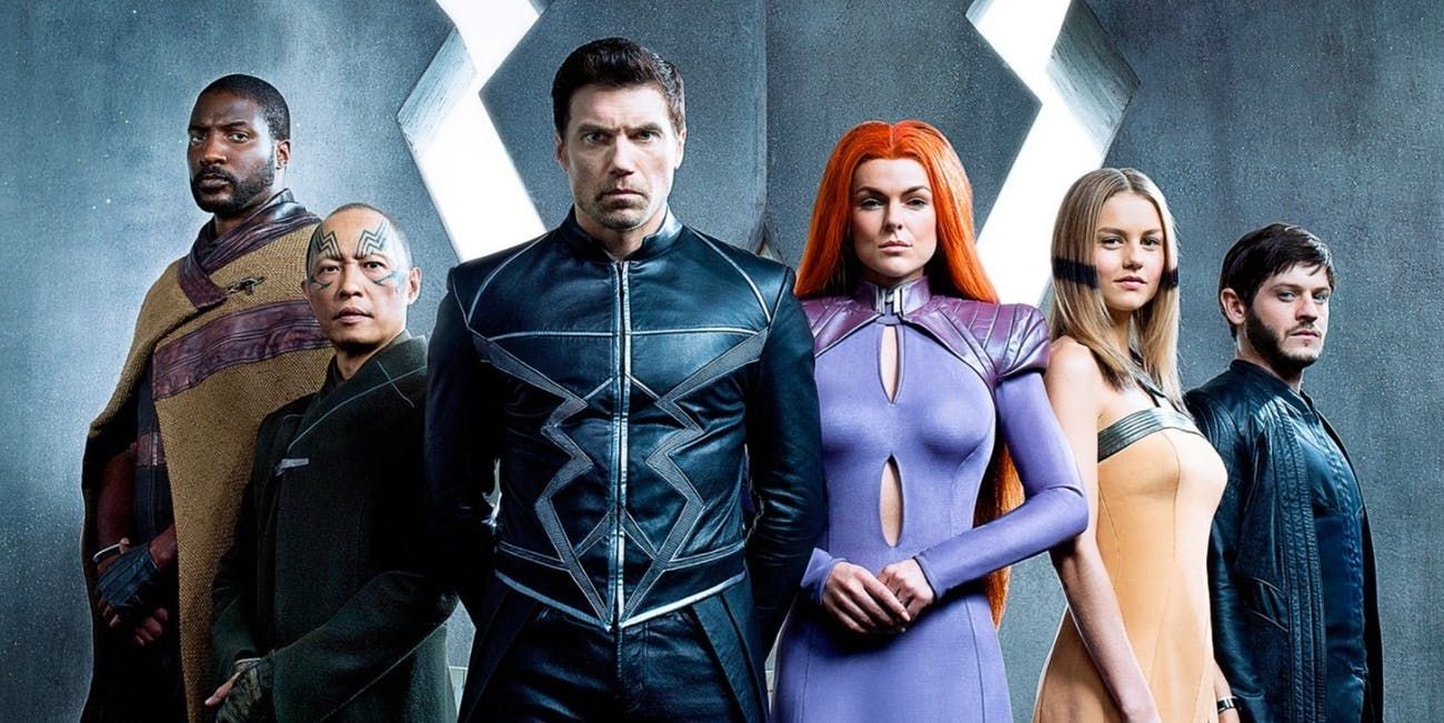
2 The Inhumans' Costumes
Talk about making aliens look ridiculous. From their clothing to poor Medusa's underrated hair, the Inhumans just do not translate well from comics to real life. The subtleties in each costume are missing in the show as well. We get that it's difficult given their powers and looks, but some CGI would be better than the end result.
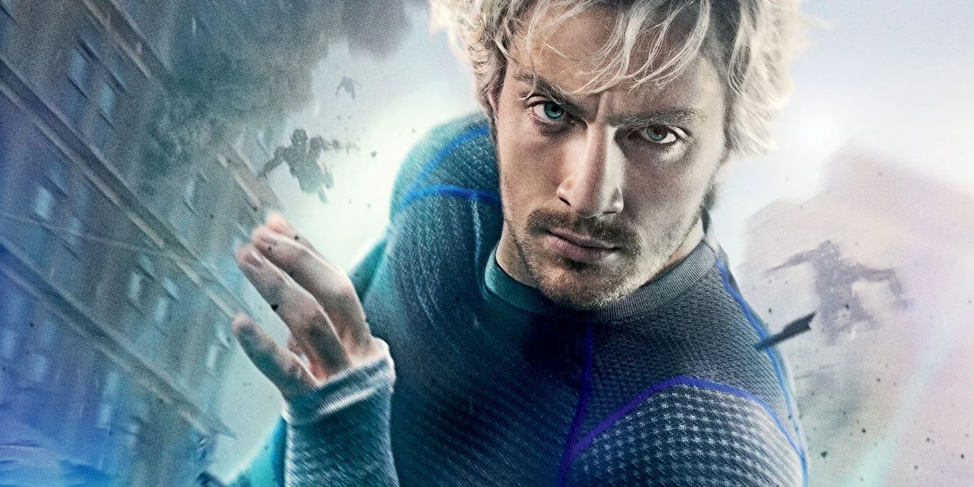
1 Quicksilver's Track Suit
It's bad enough that Quicksilver was eliminated so quickly during the Avenger saga, but he also had to suffer a goofy costume that makes him look more like a dad jogging on a Sunday than a hero. There's nothing wrong with jogging dads, and the look is a step up from the traditional lightning bold ensemble, but it just looks funny for an Avenger.

