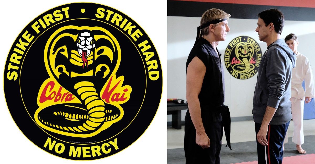
Cobra Kai instantly became the number one streamed show in the United States when it became available on Netflix. The series is a spinoff of the 80s blockbuster franchise The Karate Kid. Many fans also assumed that it was based on an actual reputable martial arts school named Cobra Kai which was established in 1971 by late Grandmaster Steven G. Abbate.
So is the Cobra Kai logo based on that school as well or just an original graphic design masterpiece? Here's the story.
The Making Of The Logo
The Cobra Kai logo was designed by Geronimo Giovanni. The logo has different versions on the show's website, merchandise, etc. But it was originally created with a black outline with the bright yellow cobra in the center with the red wordmark that says "Cobra Kai."
The name itself represents what the school is all about. It basically translates to the Grand Snake Organization with Cobra being a Grand Snake and Kai, a Japanese word that means group or organization.
The Meaning Of The Logo
The expanded hood of the cobra in the logo represents preparedness for battle and defense against the enemy. One of the popular versions of the logo is its round version with the words "Strike First, Strike Hard, No Mercy" encircling the original logo.
This version is used in the show a lot to emphasize the meaning behind the cobra to the viewers. The logo certainly looks a lot more intense than Miyagi-Do's zen-like tree emblem.
The Cobra Kai logo also matches the signature aesthetic of Netflix's original hit teen series such as Riverdale. The logo's bright colors glowing against the dark background resembles Riverdale's look, especially the South Side Serpent logo.
The Cobra Kai logo has definitely launched a variety of merchandise that fans of the show are so obsessed with. It's undeniable that the logo appeals as cool or aesthetically rebellious to viewers, especially teens.
It may look like a simple combination of different colors, elements, and words. But when we see it on the show or anywhere else, really, we can't help but be drawn to it. Funny how a logo can be as striking as that.

